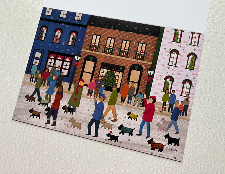
Categories
Uncategorized

It’s time for Christmas Holiday Designs!

I recently started designing for the holidays. For those of us that work in this industry, it’s a year-round endeavor. I have a hard time designing though when it’s spring and I see the cherry trees blooming, or if I’m feeling the 90° heat of summer. I’m just not in the mood. But now that we’re approaching the fall season, I’m getting into the holiday mood.

Designing gingerbread scenes has become my thing. This will be my third year, and I hope to come up with two or three concepts.  The first is done – a Christmas train scene with gingerbread conductor. Then the other two will be more ambitious. I don’t want to say what they are right now, in case they don’t come to fruition. Sometimes an illustration comes together easily, and sometimes I have a creative block and can’t produce anything.

I thought I’d share some of my in-the-making process for this scene. I made the mistake of using the wrong color profile, and when I printed a draft it looked really dark. I don’t want to get too techy about what a color profile is, but they are used for displaying color. There are different color profiles to display on a screen. Then there are some for printing purposes, and they help the printer know to print the colors.

Designing a Christmas train greeting card

Anyhow, I used the wrong one. I corrected it by switching color profiles, then I had to modify the red and green to make it more vibrant. The gingerbread conductor also printed too dark, so I lightened him up. Then I noticed the text was too low, so I moved the entire scene up to make more room. Finally, I changed some details. My eye was distracted by the wheels on the cart, so I moved it to the back. I added more presents.

I could have done more with this illustration. But sometimes if you overdo it, the design starts to lose its charm. I was thinking to come up with a punny greeting that’s train-related, but I couldn’t think of anything. But the good thing is the text can be personalized with whatever a customer wants!

Here is the final draft:

Christmas train greeting cardHopefully train lovers will enjoy this card!

Categories
Uncategorized

Filipino Food Birthday Party Greeting Card

My uncle’s 90th birthday party is today. I was going to design a special card to celebrate this milestone. Then my aunt said he was sensitive about it and didn’t want to be reminded about turning 90.

I wasn’t sure what I should come up with. But thinking about the birthday party reminded me of all the yummy food. My family is Filipino and food is our love language. My aunts and uncles cook up a storm and bring lots of dishes. We bring enough the feed the whole neighborhood. Some of them have their signature dishes we’ve come to expect at each gathering. Like my Auntie Nene makes this salmon dish with a creamy Asian sauce on top. It’s similar to the yum yum sauce you have at a Japanese steakhouse. My dad also cooks a ton of food. Everything from lumpia to so tanghon and other noodle dishes.

Could I design a card around that? I don’t tend to draw a lot of food but decided to give it a try. I’d have the cake in the middle, surrounded by the typical dishes our family serves.

I first tried drawing Pancit noodles, thinking it would be easy. Just make scribbles. But then I tried that and it just looked like scribbles. None of my attempts looked noodle-like. I didn’t realize it would be this hard. So off I went to Google to study photos of Pancit. Looking at these photos had me craving noodles morning, noon and night. But I studied the dishes carefully, noting where the shadows fell. And the patterns of the noodles.

Armed with that knowledge, I gave the noodles another try. Much better results!

Then of course I had to draw lumpia. If you’re not familiar with what that is, it’s an egg roll with meat and veggie filling. My family uses ground beef. We typically make the deep fried version.

Empanadas were next. Followed by fried fish. We usually serve a lot of meat and I added a rotisserie chicken. I know the lechon pig is something that is served. But I’ve always been squeamish about seeing the poor thing with an apple in its mouth. I couldn’t bring myself to draw one.

Then I decided to add mango slices, bistek, pork bbq kabobs and another noodle dish called palabok. Bistek is a dish with slices of beef, which is simmered in a sauce made with soy sauce, lemon, black pepper, onions and other spices. If Calamansi is available we use that instead. But in the U.S. it can be hard to find. So we just use lemons as a substitute.

Once the dishes were illustrated, I added a green background with texture to simulate banana leaves.

Filipino food birthday greeting card lumpia Pancit noodles

Then for the inside, I added a corny message:

Let me explain if you don’t understand the humor. Tuyo is a fried fish. Isda also means fish. I know, very corny. They got a laugh out of it 🙂

Overall I enjoyed making this card. It filled a longtime desire to illustrate Filipino food. I’ve always wanted to make a children’s book about my experiences with these family gatherings. If I could pull it off, it would be a fun project! Stay tuned…


Categories
Uncategorized

BTS Birthday Card Featuring Jungkook’s Bunny Cake With Grapes

I’ve been missing Jin. I know he’s only been gone for a few months, and we still have a long way to go before he’s done with his military service. For some reason, I keep thinking of when he visited Jungkook’s home on his 2022 birthday. I list the year because there are many videos celebrating the members birthdays. JK’s 2022 birthday is one not to miss! Why? It’s all because of Jin.

I think JK just planned to sing his heart out for BTS ARMY fans, and we always appreciate it. But then we see Jin make an appearance. He is a bit inebriated, and he comes with his trademark humor. They bring out a rabbit cake, I think it’s in reference to JK being associated with a bunny. I’m not quite sure what the story is behind that. But I’ve also seen Taehyung call him a muscle bunny.

Anyhow, Jin gets the idea to decorate it with grapes. Not just any grapes. These giant big green ones that he brought for JK. He keeps adding one after another. It becomes too much for the poor cake, and it collapses into a chocolate mess. I think this will go down as an iconic moment in BTS history.

So that’s the inspiration for this card. I drew the bunny to make it similar to JK’s cake, and of course I added giant grapes. Inside it says “I hope your birthday is filled with all sorts of great surprises”. Maybe I should have said something about Jin making a surprise appearance and personally decorating your cake. Haha. If I can come up with a good punchline for that, I’ll change the wording on the inside.

Inside of the card says I hope your birthday is filled with all kinds of great surprises.

I know this is a card that only BTS ARMY will understand and get, and that’s ok. I hope it brings a smile and laugh to whoever receives it! If you’d like to see the video I reference, you can probably find it on Weverse. I looked on Youtube, I finally found it under the VLive 2022 channel. I’m not sure if there are English subtitles, however there are other fan channels that capture the moment.

If you’d like to see my creative process, check out the Youtube video below. I used the Procreate app on my iPad Pro.

This greeting card is available on this website and Etsy. I also have it on Zazzle, where you can customize it any number of ways. You can change the text on the outside and inside, and they ship internationally. You can change the font and size of the card. They also have Korean fonts! Click the Personalize button, and it will take you into Edit mode. The Korean fonts will be under the International category. Let me know if you can’t find it.

Need it asap? If you have a Walgreens near you with a photo center, I can send it over there for store pickup. Message me and I’ll find out if it’s possible.

Know of any other iconic BTS moments I should sketch out? Comment below and let me know!

Categories
Uncategorized

BTS Valentine’s Day Card

It’s been a week since we saw the BTS “Yet To Come in Busan” concert movie. We had such a great time. I don’t know any ARMY fans in real life, so my dear husband came with me. Even though he didn’t know the music, he still enjoyed the concert. BTS – they are master showmen. If people could just give them a chance, they’ll find something they’ll like. They have such a varied catalog of music ranging from pop to rap. And you don’t even need to know Korean. You can feel the music from the energy and emotions. Translations of their lyrics are also available with a quick internet search.

Anyhow, that’s not why I’m writing this post. Since Valentine’s Day is around the corner, I usually make my husband a card. This year I decided to make one based on our experience with the movie. The fans brought a lot of energy to the theater with their light sticks, cheering and dancing. Everyone had a great time. Then we were impressed with the diversity of the crowd. We saw young and old, and a variety of ethnicities.

I set out to capture all that in a greeting card. Here’s what I came up with. Of course I took creative liberties with my husband and I and made us into a younger, cuter couple. Haha. I chose to give myself an off-the-shoulder purple top and a heart necklace. I gave my husband more hair 😂

Then the tag line. I thought through their lyrics, the one that came to mind was “You’re My Best Friend”. Taehyung sings that line in Spring Day. But it’s also a sad song. In the end I used it, I couldn’t come up with anything else.

Once the design was final, I cleaned it up and printed it out on cardstock. I have this new printer, a Canon Pixma Pro 200, and it prints thick cardstock like a champ. I love it. What I don’t love is the colors. I’m having a hard time getting an accurate print. I’m guessing it has to do with the color profiles, and it’s a matter of experimenting to see what works. I guess I got spoiled by my Epson Artisan printer. I never had to make any adjustments. Print colors were true to what you see on the screen. But then it died, and Epson stopped making it. So here I am with the Canon printer, making the best of it.

Here’s how the card looks printed out. The seats are a darker purple. But print quality is otherwise pretty good. Thr glowing light sticks came out well!

The last step is to trim it down to size, then score down the middle so it’s easy to fold. I’m looking forward to giving this to him, it captures a fun memory together. I also decided to place it in my Etsy shop. I have no idea if anyone will need a card like this, but if you do I’ve got you covered!

Categories
Uncategorized

BTS Fan Art Card For The Yet To Come Movie Concert

I will be going to the BTS movie in theaters February 1-4. It features their Busan, Korea concert from October 2022. It’s supposed to have never-before-seen footage, and I keep hearing about a very emotional ending. I’ve been avoiding all news articles so there are no spoilers.

I’ve never been to a BTS concert before. I discovered them during the pandemic. Then last year they announced they were taking a break as a group, for a variety of reasons. Required military service being one of them. So when they announced this concert movie, I figured it was my last chance to have the ARMY experience. In case you don’t know, ARMY is what they call BTS fans. It stands for Adorable Representative MC For Youth. I don’t quite get it. But it’s a fandom I enjoy being a part of. And it’s not just for kids and teens! It encompasses a wide range of fans – young and old, men and women, all kinds of nationalities from African to Russian to South American. And U.S. of course. They are known and loved Worldwide.

I’ve seen the Youtube videos about the ARMY bomb light stick and the fan chants. They are a very interactive audience. And not just with BTS, they are also interactive with each other. I’d seen how at Lollapalooza for J-Hope, people brought freebies to give away such as stickers and bracelets.

Anyhow, why am I writing about this on my art blog? Well, I sketched out a fan art card. Yep, that’s right! I didn’t realize what a challenge it would be to draw seven people. I found myself studying their facial features and clothing. But once I got into a rhythm, I really enjoyed myself. I started to draw each member with an iconic look, then I realized they were from different eras. So I hope it doesn’t feel to disjointed. As a greeting card designer, we aim for designs that are cohesive, where the color schemes are in harmony. I apologize if the final result is a bit chaotic, but that’s how our boys roll!

Here is how I ended up sketching the men:

RM/Joon: I wanted to give him a more current look from his Indigo album. I made his hair a little longer in the back. Then the black turtleneck. Wait, I think the turtleneck is from Sexy Nukim.

Jin: I sketched him as a military guy with beret and camo top.

Suga/Yoongi: Daechwita baby!

J-Hope (or should I say Jay): Jack in the Box hat and white suit.

V/Taehyung: Red Bandana

Jimin: Dynamite-era lavender top and cross earrings

Jungkook: Bucket hat and dark gray sweatshirt

I think the members will be recognizable based on those details. I wish I had more time; I was planning to sketch Taehyung holding Yeontan, his cute dog. I really wanted to have a dog in the sketch. But time is not on my side. I’ve had a busy week of work and there aren’t enough hours in the day.

The overall design is a polaroid-style photo with the members. Underneath “The best is yet to come” is written in reference to their concert Yet to Come as well as the song. It’s an encouraging tag line, I really like it a lot.

BTS Fan Art Greeting Card featuring all seven members. The text says "The best is yet to come".

So as I write this post, I am printing cards. I was going to bring a few dozen. I have a special message on the back that this card is especially made to hand out to ARMY at the movie. I will bring a dozen, maybe two. Still not sure yet. But I am really looking forward to the movie. And I will be dressed in purple! I initially was planning to wear a lavender shirt similar to Jimin in Dynamite. (And no he’s not my bias, I don’t actually have one.) But those plans have been changed by our chilly winter weather – It’ll be a high of 33 degrees. Instead, I will be layered in purple warmth. Thank goodness it’s been my favorite color for years, lavender specifically. I have lots of clothing in that color!

My husband will be coming along, I don’t know how he’s going to react to it. I told him expect it to be loud and practice the fan chant. I know ARMY will be singing along to every song. They’ll be waving their ARMY bombs around (if the theater allows it). And hopefully my card will be well-received! I expect to report on a very enjoyable, memorable experience. Borahae!

If you’d like to buy a card, I have it in my shop. Thank you for your support!

Categories
Uncategorized

Funny 80th Birthday Card For Men (Part 2)

So yesterday I posted about designing a greeting card for my Father-in-law, who turned 80. I set it on the kitchen counter so my husband can take it and give it to him. Well guess what? He forgot it. He was frustrated with himself, knowing that I put effort into creating a card just for this special occasion. At first I felt annoyed. But then I decided to let it go. I figured we could just drop it in the mail. I didn’t want my husband to beat himself up over it.

They went to a nice restaurant, while I stayed home and watched our autistic son. We could have taken him, but because restaurants can be noisy, my son could only handle so much with his sensory issues. So, we thought it best to keep him home.

They ended up having an enjoyable dinner! That made my heart happy. When my husband got home he told me all about it. He happened to mention that my father-in-law had scotch, and suddenly it dawned on me. I should have designed a card for that. I had seen a lot of funny whiskey-themed cards at the store. Why didn’t I think to make a card with that theme? Brilliance sometimes comes slowly.

So I ditched the speedometer card and went to work on the whiskey themed one. The ones I’d seen at the store are a glass with whiskey on the rocks. Or a bottle, usually a parody of Jack Daniels. I started to draw a glass but wasn’t feeling inspired. I didn’t want to draw a bottle of whiskey. Then I wasn’t even sure what a bottle of whiskey looked like. I don’t drink alcohol so I don’t have a clue. I pulled up Google to learn more. I learned that Scotch is a type of whiskey from Scotland, while whiskey is made in the U.S. and Ireland. I saw different types of bottles in various shapes and sizes. I was starting to feel inspired.

In the end I created a shelf of bottles, similar to what you’d see if you want to a bar. I wanted the card to have a masculine feel and chose hues of brown, black and red. I also made the bottles a little ambiguous, so it could be bourbon (another alcohol I know nothing about).

The text says, “You’ve Aged Well”. I chose the Rye font. It has a classic, vintage vibe (and also reminds me of tattoos so it has a coolness factor based on that). I may give the text a grunge look, that may go well with the design. But for now, I’ll leave as is. The inside has another corny pun and says “Just giving you an OLD-FASHIONED card to let you know you’re TOP SHELF! We hope you have an amazing birthday with many more to come!”

So hopefully my father-in-law will enjoy this one, it’s more an artsy piece. Sometimes it’s hard for me to tell how a card will be received. Especially if it’s out of my element. I usually like to draw cutesy things and was very tempted to draw happy faces on the whiskey bottles. Kawaii whiskey bottles. Haha that sounds funny! As a commercial artist, we have to be flexible and make designs that take us out of our comfort zones. I guess that’s why if you look at my store, there isn’t a defined style. I may have a full-page illustration for one card, then a simple design for the next. I always wish I could be like other artists, when you look at their portfolios and galleries their style is consistent. But that’s not me. I’m always learning something new and experimenting. As a grow and evolve as an artist, my style will change. Maybe I’ll eventually find that one style that defines me, and I’ll settle into that.

Categories
Uncategorized

Funny 80th Birthday Card For Men (Dad, Grandpa)

Today is my father-in-law’s 80th Birthday. Yesterday I wrote about how sometimes a design will come together smooth like butter. This is one of those moments, and it was an absolute pleasure to create. Of course it doesn’t hurt to have a time pressure 😉

I thought about what I should make. In prior years I made him a card with a wine theme. So I didn’t want to repeat that. Then I thought about the other themes you see in the stores – fishing, beer and sports. None of those seemed like a good fit, so then I thought about cars. He does like vintage cars if I remember correctly. But to me, vintage cars seem slow. I’ve never seen one race down the street. Usually you see them on display at shows.

Then I thought about the number 80. There isn’t a whole lot associated with the number 80. Maybe a temperature? Bottles of beer? Nah. Not good for a card design.

In the end I came up with a speedometer. I had designed a snore-o-meter card last year, similar concept. The needle points to 80. Then I added color in the background, starting with green in the 20s. Then the color grading goes to yellow, orange and finally red.

It’s a basic design, and for the concept I’m trying to create, it works. The design is center and the focal point. Now for the text. With my corny sense of humor (thanks Mom), I came up with “There’s No Slowing Down Now!”.

If that makes you groan, just wait until you hear what the inside says. I printed “Wow you’re already 80 years old? That was FAST!”. Then I added “Wow the years sure SPEED by, don’t they?”.

Then I concluded the message with “We wish you a wonderful birthday with many more to come!”.

Sooner of later it will make it to this website’s store. But for now, time to print! I recently got a Canon Pixma Pro, based on other artists recommendations. I will admit, I liked my Epson Artisan better. The colors just came out better. But unfortunately my Artisan printer stopped working after a few years, and Epson discontinued it. So I will figure out how to make good prints with the Canon Pixma.

Then for paper, all I have is Red River cardstock. I also bought that based on other artist recommendations. People raved about the paper and shared photos of finished cards with their artwork. I was impressed and order a box. To my big surprise, I found the paper very thin. I usually like a 110 lb cardstock, 120 lb is even better thickness. But the printer usually has a hard time printing it. This Red River cardstock was something like 60 lb, I wish I paid better attention. It just baffles me how people rave about how great it is. That’s too thin for greeting cards.

Anyhow, enough about that. I hope he likes the card. It’s not a traditional sentimental one. But that’s not what I’m all about. Well ok sometimes I am. But not in this instance. This card is more modern with a sense of humor. I hope he likes it. If you are reading this, what do you think? Appropriate for an 80th birthday, or no?

Categories
Uncategorized

Card In The Making

My mom, who is a cancer patient, got Covid a few weeks ago. She had been careful to wear her mask, get her booster and be careful of her surroundings when she’s out in public. But like the rest of us, it couldn’t be avoided. When she first told me I felt panic. Even though she is currently cancer free, she doesn’t have a strong immune system. Her oncologist was very responsive and prescribed Paxlovid. And within a few days she was feeling better. Phew!

My mom commented about how helpful her oncologist was, and how quick and responsive she was. She was just so thankful. So I told her that I would design a thank you card for her. It was the least I could do to show appreciation for being her doctor all these years.

Sometimes in the design process, the concept comes together pretty quickly. It’s smooth like butter. Then other times it’s a struggle. That’s what I’m going through right now. I don’t design cards for the medical profession so I’ve been brainstorming these past few weeks. I kept thinking about how the oncologist is like a guardian angel. And it would be great if I can draw a beautiful one. But when I think of angel illustrations, they’re either folksy or like renaissance art.I wanted something more modern and contemporary. I tried to sketch something; and I couldn’t get the concept down.

Then it dawned on me. I don’t even know what my mom’s oncologist looks like! That’s the problem sometimes when you’re making an illustration of a person. As a greeting card, it should be more general so it can be applicable to a man or woman. Or a dark or light skinned person. This suddenly felt so complicated.

So I abandoned the idea of drawing an Angel. Which is good, because one thing I struggle with it drawing hands. I dread drawing people because of this. Why are hands so hard to draw?

Then I thought about making a funny design. I pictured an oncologist wearing the white coat. But also with wings of an Angel. And a superhero outfit under that coat. This was quickly becoming absurd.

So that places me back to Square One. I need to take a break from it. Sometimes when I step away from design, I’ll find my inspiration as I go about my day. It could be as simple as passing a person on the sidewalk. Hearing a song. Or seeing a color scheme in the store. That’s probably the best approach for now. The design will come in its own time.

Categories
Uncategorized

Gifts and Cards for the Mail Carrier

it’s December 23, and I’m feverishly trying to finish a Christmas thank you gift for our Mail Lady. I designed a cute gingerbread postal theme card. I know it sounds strange, see below for a photo of the card. The idea popped into my head one day, and the thought just made me laugh. Right then I knew I had to sketch it out. This is my first year of offering it, so I don’t know what the mail carriers will think of it. But I have sold a good number of these cards. I’m sure I’ll got feedback after the holidays.

Anyhow, about the gift. I came up with an idea to make chocolates that look like mail trucks. I had done it before with school buses. So why not mail trucks?

I went through several iterations of the design. These are small labels that will fit on Hershey nuggets. So when you’re designing for a small scale like that, there’s a lot of considerations to take into place. And you also have to think about where it will be printed on. If it’s an inkjet printer, you have to be careful of how the lines will print out. I went through several designs to get to this final one.

Here’s a photo of what I came up with. A few things to note. I have a laser printer, but it’s not color. So I printed the labels on white paper. Then I used Crayola thin line markers to make the blue and red lines. The funny thing is I forgot to add the wheels! So then I had to spend time drawing those in. But I like it! It gives it more of a whimsical feel.

Chocolate gift candies with postal mail truck design for mail carriers, mailman or mail lady.

I get the “sharing size” bag of Hershey nuggets, it has 27 pieces. The page prints 24 labels so it’s a close match. Then once I wrap each nugget, I hold it together with scotch tape. Then I put them in a cellophane bag and add a festive ribbon. It’s all ready for gift giving. But I don’t stop there.

Now, the final step! I placed the chocolates in a tall mug. It has my gingerbread postal design. And it’s a bigger 15 ounce mug. Tada! All done. I bubble wrap to protect it, then place it in a gift bag with my card. Then off to the mailbox it goes for our Mail lady.

Holiday Christmas mug gift for mailman, mail carrier or mail lady

You might be asking – Why do I go through such great lengths to give something special to our mail lady? And why do I design so many postal theme cards?

The answer is – my dad. He was a Mailman for many decades before retiring. I developed an affinity for the Postal Service through that. During the holiday season, he would work long hours to deliver cards and packages. And his customers would give him gifts and cards. He would bring home things like Starbucks coffee and Frango chocolates. We lived in Washington state at the time, and the locals are very loyal to that coffee chain and chocolate brand. Our Christmas tree would be lined with all sorts of goodies. And of course he shared all that with us. I had a steady supply of candy and chocolate, thanks to the people on his route. As a kid, that was a big deal! I looked forward to it every year.

I also saw how hard he worked. The roads could be icy and treacherous, but he still had to go in and deliver the mail. There could be a snowstorm. He still went in. He would leave early morning in the dark, and return home in the dark. The hours were long. And this was before Amazon became as big as it was today. I can only imagine how much more busy the post office is now with those Prime deliveries.

It’s been many years since he retired. But I still make it a point to thank my mail carrier. When I see them, I can’t help but think of my dad. So every year I make a new design in honor of him.

Here are some of the designs I’ve made over the years. They’re all on Zazzle. When I have time I’ll post them on this site too.

This is my very first design published in 2015. I had seen people put antlers and red noses on their cars. And wreaths in the front on the grill. Surely you’ve seen that in your area? So I thought – why not put it on a mail truck? Be kind. I was fairly new to graphic design then. I’ve come a long way since.

This design is more of a cozy winter scene. It has a mail truck driving down a windy hill.

Then I have to share my pandemic design! I sketched out a scene where two dogs are looking out the window. They see the mailman coming in his truck, then they notice he’s wearing a mask. But to them, it’s a muzzle. So they’re feeling a bit of confusion. They don’t quite realize why he’s wearing one. I thought it was hilarious at the time. When I look at it now I think “2020 sure did suck!”

I have other designs. But do you really want to see them all? Probably not. Now you know why I’m so passionate about making these. These postal workers do a lot to keep the mail and packages coming to our homes. A small gesture like a hand written note will brighten their day and they’ll feel appreciated. You don’t even need a special card. Any one will do. Just acknowledge what they do, day-in and day-out.

Do you have an idea for a card? Can’t find what you’re looking for? Let me know, I may be able to create it. I start to develop a concept in the fall, as the weather grows colder and we approach the holiday season. I might have a goofy funny idea, or it may be sweet. I suppose I could try something more traditional. Let me know what you’d like to see!

Categories
Uncategorized

I Published A School Bus Coloring Book

This post is about how I developed the coloring and activity book about school buses.

You can order a copy on Amazon:

Read on to learn more about how I created the book !

It’s the middle of the holiday season and my mind is turning towards gifts for my family. My youngest is autistic, and if you know anything about them, they tend to have narrow interests. That makes it challenging to find gifts for him. He loves school buses, pizza, Pentatonix and potato chips. I searched the internet and found a couple things like this cute pencil case:

I’ll fill it with his favorite chocolate and stick it in his stocking. But what could I get him for a Christmas gift? I was stumped. We’ve gotten him all sorts of school bus toys. We had so many that at one point, I donated them to the school.

Finally, I got the idea to make him a coloring book. I was initially going to buy one, but the ones on Amazon didn’t get the best reviews. I wanted him to love the book I got him. I wanted to see him fill the pages with color.

My first challenge was figuring out what to put in the coloring book. It gets boring and repetitive if you’re just coloring a school bus for 30-40 pages. Not to mention you’ll wear out the poor yellow crayon. Just think of what it had to say in The Day The Crayons Quit. Don’t wear it down to a nub.

This was also my first time creating a coloring book. I studied the ones that my son colored through, just to understand its structure. I decided it needed a storyline, even just a basic one that carries through the book. A storyline makes it more cohesive.

My first page, which also became a book cover, was a bus riding down the street.

sketch of coloring page of a school bus driving down the street
Sketch of the first page

I wanted to call it “Oh The Places It Goes”. But it sounded too much like the Dr. Seuss book. Then I wanted to call it “Oh What Fun It Is To Ride”. But my husband thought it was too long. So in the end I called it “Oh What Fun To Ride!”.

School Bus Activity and Coloring Book

Then I started to think about where the bus travels. which is basically through the neighborhood to school and back. Was there more to it? And why do some kids, like my son, love school buses so much? Is it the bright and happy yellow color? Is it feeling like you’re going on a trip every time you step on? I don’t think it’s because riding the bus is an exciting thrill ride, speeding down the street (unless you’re Keanu Reeves at the wheel). Rather it’s the opposite, with the bus stopping every other block or so. Maybe part of the fun is seeing your friends and classmates join you each step of the way. And maybe, just maybe, once you step on the bus, you’re in a parent-free zone and feel a bit of independence. The more I thought about it, the more I started to understand the appeal of the school bus. It’s the transition between the home and school environment. It’s about the ride, and anticipating what’s at the end of it.

I decided to do a “day in the life” of a school bus. I sketched out scenes of the bus going on field trips to the pumpkin patch, zoo, camp, amusement park and other places. I drew a scene of the bus driving in rainy weather, with kids walking around in umbrellas. The illustrator in me started to get very detailed, like in the downtown scene. I had to keep reminding myself that this was a kids coloring book and to keep it simple. Haha.

I also decided to make it more interesting and interactive by adding mazes and complete-the-scene prompts. It became an activity book as well as a coloring one. I hope whoever uses it will find it engaging. Coloring and activity books are a great alternative to screens and video games. It spurs creativity and helps those gross motor skills. It’s also a simple activity you can do with your child. You can color together, assist them with the prompts, and help them out if they’re stuck in a maze.

Coloring books are also portable. Take it to the car, the restaurant, the doctors office. And you never need batteries! Just a good set of Crayola crayons. They’re the best brand for coloring. I love to get the huge sets with every hue of the rainbow. I’ve loved them every since I was a little girl.

I enjoyed making this book and seeing it come together. It was a different process I’ve never done before. I didn’t have to color in, add shade and texture. I didn’t have to be mindful about keeping the color schemes consistent from page to page. I just had to draw outlines in black.

The coloring book is 8.5 x 11 inches and has 40 pages. It has single-sided pages, meaning that there isn’t an image on the back. I wasn’t sure how thin the pages would be, and if coloring on the front would show through the back. Kids can color with crayons and markers. They won’t have the color bleeding through the page. And they can also tear out the page to hang on the wall.

A school bus lover would enjoy the book. The target age range is maybe older kids in elementary school. I tried to capture what a kid would find fascinating and love about school buses. I drew scenes that I thought would align with their interests. Preschoolers might enjoy it but would need the assistance of an adult. If anything, it gives them a preview of what to expect in elementary school.

You can order a copy on Amazon:

I’d love to hear your feedback and what you thought about the coloring book. Comment below, or review it on Amazon. Or both! Since this is my first, I’m sure there is much room for improvement. I’d appreciate hearing what you have to say.